The short version#
Across decades of publishing, Marvel built a distinctive identity by grounding grand heroic concepts in specific, human drama and restless visual experimentation.
- Fantastic Four #1
- Jeff Week Infinity Comic #5
- Daredevil #190
- Fantastic Four #243
- The X-Men #128
- Warlock #15
- The Savage Sword of Conan #1
- The Avengers #97
- Daredevil #6
- Journey into Mystery #20
Marvel built its identity on a specific kind of friction. The publisher threw godlike concepts against ordinary, often inconvenient human lives, then asked artists to figure out how that tension actually looked on cheap newsprint. Giant monsters tore up real Manhattan intersections. Teenagers got bitten by radioactive spiders and immediately worried about paying rent. Space gods arrived with existential threats, but the characters spent half the issue arguing in a kitchen.
That balance between the cosmic and the domestic required relentless visual experimentation. Kirby broke panels wide open to convey scale that standard grids could not hold. Later creators pushed further, bringing cinematic pacing, painterly textures, and abstract layouts to monthly newsstand books. The medium evolved because the stories demanded new ways to show pressure, speed, and grief.
When you look across sixty years of these books, the standout issues are rarely just major character debuts or pivotal plot points. They are the moments where script and art locked together to solve a specific creative problem. A writer decided to isolate a hero in an impossible location. An artist decided to draw a fight scene as a continuous geometric pattern rather than a sequence of splash pages. A colorist experimented with high-contrast inks to make a street-level noir feel damp and heavy.
The ten issues below span decades, genres, and publishing formats. They include oversized magazine experiments, quiet character studies, and modern digital experiments built for a phone screen. Each one marks a point where Marvel shifted what a mainstream comic book could look like on the page.
| # | Item | Set / Year | Rarity |
|---|---|---|---|
| 1 | Fantastic Four #1 | marvel | — |
| 2 | Jeff Week Infinity Comic #5 | marvel | — |
| 3 | Daredevil #190 | marvel | — |
| 4 | Fantastic Four #243 | marvel | — |
| 5 | The X-Men #128 | marvel | — |
| 6 | Warlock #15 | marvel | — |
| 7 | The Savage Sword of Conan #1 | marvel | — |
| 8 | The Avengers #97 | marvel | — |
| 9 | Daredevil #6 | marvel | — |
| 10 | Journey into Mystery #20 | marvel | — |
10. Journey into Mystery #20#
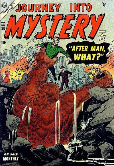 Journey into Mystery #20See it on collecto.rs
Long before spandex and costumed vigilantes took over the line, Marvel built its house on giant monsters with silly names and impossible sizes. Journey into Mystery #20 belongs to that pre-superhero era of late-fifties horror and science fiction anthologies. These books were cheap thrill machines, churned out on tight deadlines by creators who were still figuring out how to make a comic page feel like a ticking clock. The stories were simple, but the mechanics were precise. Giant beasts stomped through panels, scientists panicked in close-ups, and twist endings landed with a heavy thump on the final page.
That assembly line forged the visual language of the publisher. Artists learned how to use heavy black shadows to build dread and how to break a grid to make a creature feel too big for the paper. Writers learned how to drop a reader into the middle of a crisis within three panels. When superheroes eventually returned to the lineup a few years later, they inherited those exact pacing tricks and panel setups. A hero punching a cosmic villain in 1965 used the same panel math as a giant mole invading a city in 1957.
Where an issue like Daredevil #6 uses the concrete realities of real city blocks to make a absurd costume feel grounded, this issue operates on pure, unbothered atmosphere. It relies entirely on dramatic staging and exaggerated dread to hold your attention. It is a work of pure genre craft, built before the continuity web took over and turned every title into a small piece of a larger puzzle. You read it to see the blueprint before the building went up.
9. Daredevil #6#
 Daredevil #6See it on collecto.rs
Daredevil swings through Hell’s Kitchen, lands on a fire escape, and wrestles a man in a quilted purple jumpsuit called the Matador. The villain is ridiculous, but the bricks are real. In Daredevil #6, Stan Lee and Joe Orlando set a blind lawyer against a disgraced bullfighter in the middle of Manhattan. What makes the issue hold up is not the villain’s cape work. It is the way the city anchors the drama.
Pre-hero monster books like Journey into Mystery #20 built suspense by dropping giant beasts into isolated caves or vague American towns. Daredevil #6 took the opposite approach. It pinned superhero action to recognizable street corners, tenement rooftops, and subway stairs. When Daredevil leaps across an alley, you feel the drop because you know what a New York alley looks like. The real geography pulls the absurdity down to earth.
Joe Orlando had a brief run on the title, but his line work captured the heavy, crowded texture of mid-century New York. He gave the buildings weight. Windows have sills; roofs have water towers and clutter. That grounding gave Marvel a template for street-level heroes. A guy in tights fighting a guy with a cape works when the concrete underneath them looks like it needs a power wash.
If you collect early Marvel, this issue marks the moment the publisher decided the real world was a better backdrop than a fictional metropolis. It established that Marvel’s best setting was just outside the reader's window. You can log your copy on collecto.rs to track the condition of its yellow cover, tag the creators, and keep your early Silver Age run organised alongside the rest of your cabinet.
8. The Avengers #97#
 The Avengers #97See it on collecto.rs
Page 14 features two panels of Rick Jones staring down the Supreme Intelligence. That single sequence closes out a nine-issue run that redefined what a superhero team book could handle. Before this storyline, team titles rotated through villain-of-the-month formulas. Readers got a self-contained brawl, a brief character beat, and a prompt to buy next month's installment.
The Kree-Skrull War changed the scope entirely. It dragged the Avengers out of New York and thrust them into the crossfire of two ancient alien empires. Roy Thomas, along with artists Sal Buscema, John Buscema, and Neal Adams, proved that Marvel could stretch a single narrative across nearly a year of publication without losing momentum. The stakes felt massive, but the core focus remained on individual humanity.
Compare this to Daredevil #6, where the narrative weight relies on the claustrophobia of real Manhattan alleys. That issue grounded Matt Murdock by sticking his yellow suit into recognizable city geography. Issue #97 does the opposite. It hurls earthbound characters into deep space, yet the emotional anchor holds just as firmly. Goliath deals with his shrinking abilities while the Vision grapples with his synthetic nature. The cosmic backdrop makes those personal struggles feel larger, not smaller.
For anyone building a Silver or Bronze Age Marvel run, this issue marks the moment team books acquired a modern sense of continuity. The scale expanded, but the characterization stayed intact. It remains a blueprint for every crossover event that followed. You can log your copy in your collecto.rs workspace, add high-resolution scans of the Neal Adams cover, and export your entire index whenever you need a clean record of your collection.
7. The Savage Sword of Conan #1#
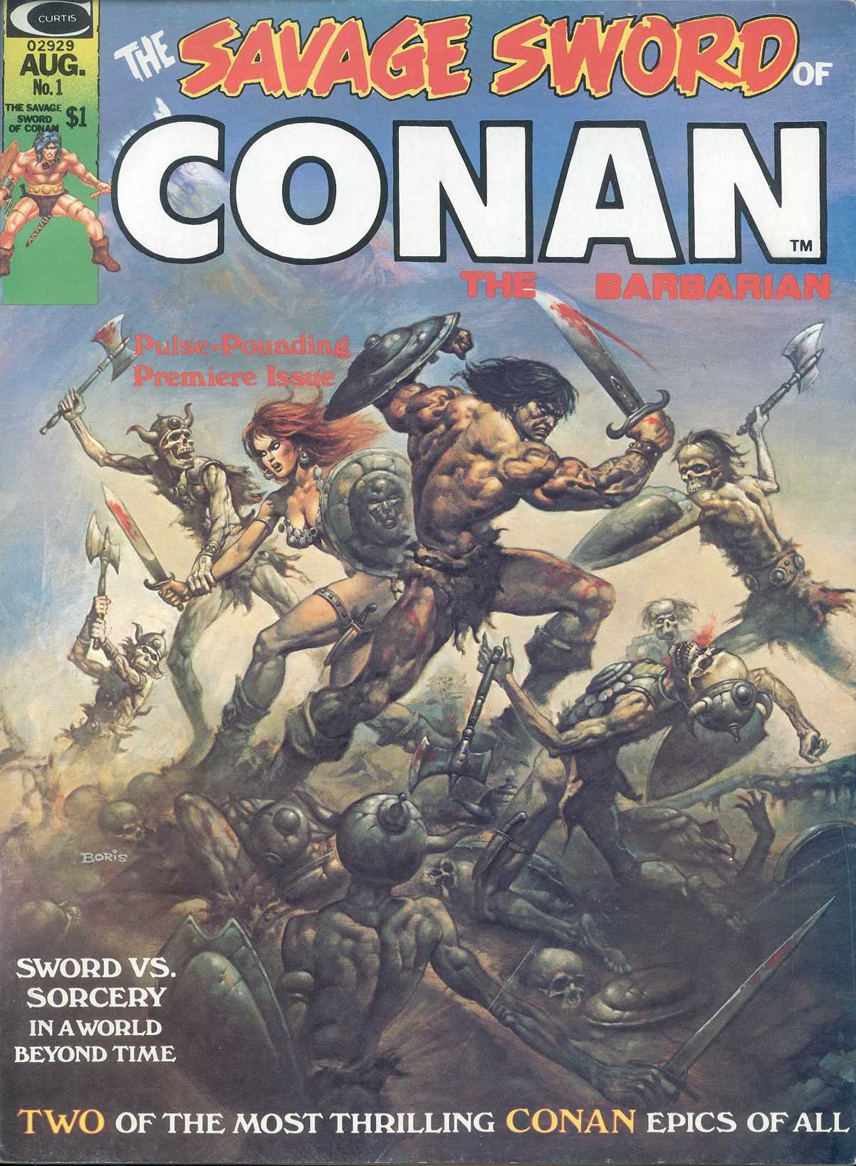 The Savage Sword of Conan #1See it on collecto.rs
Roy Thomas kept a copy of the Comics Code Authority guidelines near his typewriter. He mostly used it as a coaster. By 1974, Marvel wanted to push fantasy violence and darker pencil shading further than newsstand censors allowed. The workaround was simple: stop printing it as a comic book. Magazines did not fall under Code jurisdiction, which opened up ink washes, heavy blacks, and longer stories aimed at an older reader.
That format change gave John Buscema room to breathe. Without the restriction of four-color newsprint, his line work for Conan the Barbarian shifted. He used charcoal textures, deep cross-hatching, and panel transitions that felt closer to classic book illustration than standard superhero layouts. The opening issue established a darker, heavier tone for Hyborian Age storytelling that Marvel spent the next decade refining across its magazine division.
Where Jim Starlin used Warlock #15 to dismantle panel structures with surreal, philosophical cosmic art, Buscema used this oversized magazine layout to ground his hero in dirt and muscle. Both books expanded what Marvel could look like, but Savage Sword did it by stripping away color entirely. The contrast between line and shadow carried the entire narrative weight.
Black-and-white magazine issues often present unique storage decisions. The larger trim size means standard comic bags won't fit, and the heavier paper stock places different demands on your storage setup. You can log your copy in collecto.rs to track format variations, page quality, and binding condition alongside the rest of your runs.
6. Warlock #15#
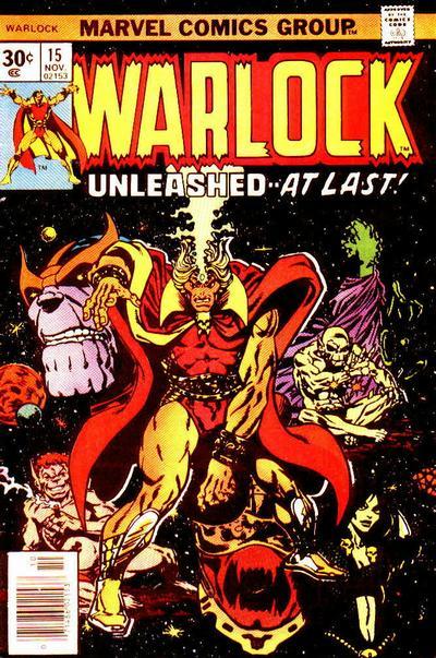 Warlock #15See it on collecto.rs
People usually talk about Jim Starlin like he was a writer who happened to draw. The reverse is closer to the truth. Warlock #15 shows what happens when a creator stops treating a comic page like a grid of rectangular windows and starts treating it like a single, exploding canvas. Starlin did not just send Adam Warlock into space. He stripped away the traditional borders, rotated panels on their axes, and forced your eyes to move across the page in geometric patterns that mirrored the character’s losing battle with his own sanity.
While black-and-white magazine formats gave creators in The Savage Sword of Conan #1 a path past the Comics Code Authority through explicit violence and mature line work, Starlin found a different kind of freedom within the mainline color books. He bypassed the Code’s structural boredom through pure visual hallucinogenics. The narrative inside this issue is heavy, cosmic philosophy, but the actual weight comes from the ink. Shadowed shapes fold into impossible dimensions, cosmic entities loom over tiny figures, and splash pages feel less like promotional pin-ups and more like diagrams of a fever dream.
That willingness to bend the physical layout of the page transformed how cosmic stories looked for the next decade. Starlin proved that space was not just a dark background with dots painted on it. It was a place where narrative logic could break down entirely, provided the artist had the draftsmanship to hold the madness together. If you track Marvel’s journey from grounded street crime to sweeping, multi-dimensional epics, this issue marks the exact point where the cosmic side grew up and got weird. It remains a masterclass in layout as storytelling.
5. The X-Men #128#
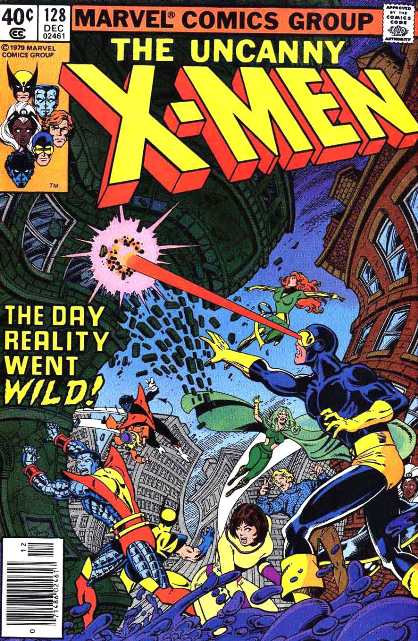 The X-Men #128See it on collecto.rs
How long can a story hold its breath before the tension snaps? By the time Chris Claremont and John Byrne reached this issue in 1979, they had spent months laying the groundwork for Proteus, the energy-draining Mutant X. The payoff works because the creative team treated continuity as a slow burn rather than a quick stunt. Readers had watched these characters clash, heal, and doubt themselves across dozens of issues. When Moira MacTaggert confronts her own son, the stakes feel heavy because the history behind them is real.
While John Byrne used his run on Fantastic Four #243 to clear away decades of continuity in favor of stark, solitary scale, here he does the exact opposite. He culls energy from the sheer density of the X-Men’s past. Every panel relies on what came before. Proteus is not just a monster of the week attacking a mansion. He is a tragic consequence of secrets kept by the team’s closest ally. Byrne’s line work captures the raw exhaustion on Wolverine and Cyclops as their physical attacks fail against an enemy who warps reality itself.
This issue proved that superhero comics could sustain the emotional weight of a serialized novel. The horror comes from intimacy, not just property damage. You watch a team realize that some threats cannot be punched into submission, forcing them to confront the cracks in their own foundation.
If you keep this issue in your own collection, you can log the spine condition, upload high-resolution scans of the Byrne splash pages, and track your copy alongside the rest of your Bronze Age run on collecto.rs.
4. Fantastic Four #243#
 Fantastic Four #243See it on collecto.rs
Frank Miller relied on dense shadows and tight cinematic panels in Daredevil #190 to make a street-level story feel claustrophobic and urgent. John Byrne took the opposite approach here. He cleared out decades of narrative clutter and let the page breathe, giving Galactus a physical presence that fills every panel he touches.
Issue #243 lands in the middle of a story arc where the Devourer of Worlds collapses on Earth, starving and vulnerable. Instead of delivering another standard brawl between caped heroes and a cosmic force, Byrne treats the situation like a slow-moving natural disaster. The Avengers, Spider-Man, and the Fantastic Four gather around a dying giant. The tension comes from a moral dilemma rather than a fistfight: do you save the creature that ate thousands of inhabited planets, or do you let him die on a Manhattan street?
Byrne handled both the writing and the pencil art for this run, which allowed him to control the pacing with absolute precision. He stripped away the heavy, ornate dialogue that had settled into Marvel titles during the previous decade. Characters say what they mean, do what they must, and step out of the way of the art. The pencils are clean, direct, and focused on weight. You feel the scale of the machinery, the exhaustion in Reed Richards, and the sheer impossibility of the choice facing the team.
This issue stands out because it reframed what a superhero comic could do with its own continuity. Byrne respected the decades of history that came before him, but he refused to let old tropes drag the story down. If you keep your comic run logged in collecto.rs, this is the issue where the modern era of cosmic Marvel truly snaps into focus.
3. Daredevil #190#
 Daredevil #190See it on collecto.rs
Matt Murdock lies on a rooftop, bleeding through his suit, while a ninja from the Hand silently drops from a water tower behind him. Frank Miller does not use splashy sound effects or bright primary colors for the hit. He uses six horizontal panels of total blackness, punctuated only by the stark white silhouette of a katana cutting through the rain.
By 1983, newsprint was cheap, the ink bled, and most superhero titles compensated with loud, overcrowded layouts. Miller went the opposite direction. In this issue, he strips the page down to heavy shadows, negative space, and relentless cinematic pacing. He treats the alleyways of Hell’s Kitchen not as generic city backdrops, but as claustrophobic corridors where every shadow hides a threat. It changed how street-level comic books were drawn, proving that cheap paper could carry the tension of a noir film if a creator understood panel rhythm.
Where John Byrne’s work on Fantastic Four #243 pushed Marvel’s cosmic boundary with grand scale and cosmic dread, Miller brought the publisher’s focus down to the pavement. The stakes in this issue are not about saving the universe from Galactus; they are about a broken hero trying to survive three city blocks. The stark ink work relies on what is left unsaid and unseen, trusting you to fill in the dark corners of the page yourself.
If you track Miller’s run, this issue stands as a masterclass in visual discipline. You can log your copy in collecto.rs to document the cover grade and track your run progress alongside the rest of your early eighties keys.
2. Jeff Week Infinity Comic #5#
 Jeff Week Infinity Comic #5See it on collecto.rs
Twelve vertical panels, zero word balloons, and one land-shark who refuses to stop eating houseplants. Jeff Week Infinity Comic #5 runs on the specific mechanics of the phone screen, using the infinite canvas format to turn a simple gag into a study in timing. Marvel launched its digital-first line to fit modern reading habits, but this issue shows how the format changes the art of the visual payoff. Instead of turning a physical page to find a splash, you drag a thumb upward to let a joke unfold at your own speed.
Gurihiru’s art relies on clean lines and clear silhouette work to navigate the vertical space. Traditional comic pages force your eye through an S-curve across two facing leaves. Here, the layout is a straight downward line that rewards deliberate pacing. A panel might stretch twice as long as a standard screen height, forcing you to scroll past Jeff’s trailing tail before you see the mess he left behind in the kitchen. The humor comes directly from that controlled delay.
While Frank Miller relied on dense shadows and tight cinematic panels in Daredevil #190 to make a street-level story feel claustrophobic on cheap newsprint, this issue uses white space and digital brightness to make silence feel lightweight. It proves the publisher can adapt its panel pacing for new screens without abandoning character-driven comedy. The format strips away speech bubbles entirely, trusting the art to carry every beat of the plot.
Digital files can feel ephemeral, drifting off into app updates and shifting server licenses. Keeping track of where these digital-first runs sit alongside your physical floppies gets tricky fast. You can log your Infinity Comic issues on collecto.rs right next to your print books, keeping your entire run visible in one place without losing the details. The medium changes, but the core of the collection stays the same.
1. Fantastic Four #1#
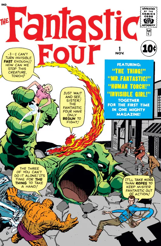 Fantastic Four #1See it on collecto.rs
Stan Lee typed the script on a portable Underwood while Jack Kirby sat at a wooden drawing board down the hall, pencil lead dusting his forearms. Neither man expected the comic to last past the first arc. DC had just found success with the Justice League of America, and Marvel needed a superhero team to stay solvent. Instead of copying the polished, perfect gods across town, Lee and Kirby made four people who yelled at each other in a subway car. Reed Richards was stubborn and cold. Ben Grimm hated what he had become, staring at his rock-encrusted hands in dirty city rain. They did not wear costumes in the first issue. They wore street clothes and panicked when their bodies broke down.
That tension changed American comic books in a single month. Before this issue, heroes were civic icons who smiled for photo ops and saved cats from oak trees. After it, Marvel built an entire publishing empire on the idea that saving the world does not fix your rent or cure your temper. The Monster on the cover was big and orange, but the real drama lived inside the blue-panelled living room on Yancy Street.
Decades later, Marvel would experiment with digital layouts in Jeff Week Infinity Comic #5, stretching panels vertically to fit the glass screens in our pockets. The delivery mechanism changed entirely, yet the core mechanics remain identical to what Kirby laid down here. It is still about character friction, precise pacing, and the quiet human beat right before a fist hits a jaw. If you put this comic in your workspace on collecto.rs, you are holding the exact cornerstone where the modern sandbox started. Everything else in the publisher's cabinet, from cosmic godheads to street-level vigilantes, traces its pedigree back to these forty-eight pages of cheap newsprint.
A collection of Marvel comics is ultimately a record of creative problem-solving. Over thousands of monthly deadlines, writers and artists repeatedly reinvented how paper and ink could convey motion, scale, and internal conflict. Some solved it with cosmic scale and explosive page layouts. Others solved it with silent panels, dense shadows, or a single frame of a character sitting alone in a room.
The ten issues here capture those shifts as they happened. They show a publisher testing the limits of its own format, moving from monster magazines to prestige paper and digital screens without losing the core impulse: grounding wild ideas in sharp, specific craft.
If these issues are sitting in your long boxes, Mylar bags, or a stack on your desk, they belong in a space that respects the work behind them. You can catalog your comic collection on collecto.rs, document the exact printings or variants you own, and keep your inventory organized down to the slab or grade. Your data remains yours to export whenever you want.
Frequently asked questions#
What makes early Marvel Silver Age comic books distinct from other publishers of the era?#
Marvel set itself apart in the early 1960s by giving characters personal flaws, real-world locations like New York City, and interconnected storylines. Instead of invulnerable archetypes, readers saw heroes arguing over rent, dealing with illness, and reacting to public mistrust. Jack Kirby and Steve Ditko also introduced a dynamic, kinetic art style that relied heavily on visual storytelling, distinctive panel layouts, and expressive character posing.
Why are magazine-format titles like The Savage Sword of Conan significant to Marvel history?#
In the 1970s, magazine-format titles allowed Marvel to publish stories outside the authority of the Comics Code Authority. This let creators explore darker fantasy themes, explicit violence, and complex painterly black-and-white artwork. Formats like Savage Sword opened up newsstand distribution outside traditional comic shops and attracted artists who wanted to work with large-format tonal ink work.
How do digital infinity comics differ from traditional single issues?#
Digital infinity comics are designed specifically for vertical scrolling on screens rather than side-by-side page flips. Creators frame panels to transition continuously as the reader swipes down, changing how pacing, reveals, and visual gags are constructed. While traditional floppies rely on page turns for suspense, vertical comics use seamless vertical movement to control timing.