The short version#
VIZ Media defined how English readers experience manga. These ten volumes show the editorial, formatting, and narrative choices behind that influence.
- Naruto, Vol. 1: Uzumaki Naruto
- One Piece, Vol. 3: Don't Get Fooled Again
- Dragon Ball Z, Vol. 1 (VIZBIG Edition)
- Jujutsu Kaisen, Vol. 11: The Shibuya Incident--Gate Open--
- Vagabond, Vol. 21
- Hell’s Paradise: Jigokuraku, Vol. 2
- Mashle: Magic and Muscles, Vol. 4
- Ouran High School Host Club, Vol. 2
- Hunter x Hunter, Vol. 11: Next Stop: Meteor City--The Junkyard of the World
- Chainsaw Man, Vol. 2: CHAINSAW vs. BAT
VIZ Media did not just import manga. It translated a visual grammar for an audience that grew up reading left to right. In the early days, that meant flipping artwork, re-lettering sound effects by hand, and convincing North American bookstores to stock graphic novels that looked backwards. By the time VIZ settled on the unflipped format with localized lettering, it had established the standard for how serialized Japanese comics exist in English.
That translation work goes far beyond changing words. It happens in the physical choices: paper stock, spine design, trim size, and omnibus bindings. It happens in sound effect choices that preserve a artist's original ink while keeping the page readable. It happens in editorial decisions about when to retain cultural terminology and when to find an equivalent that lands with the same weight.
Collecting VIZ volumes means tracking these choices over four decades. You can see the shift from single-chapter floppies to thick VIZBIG editions on your shelf. You can trace how different imprints—from Shonen Jump to Signature—handled delicate line work, heavy blacks, and panel pacing across paper stocks that vary from newsprint to bright white. The physical book tells the story of the publishing decision behind it.
These ten volumes capture those decisions at work. Each one marks a moment where editorial restraint, paper choice, translation framing, or structural format aligned to deliver a specific story precisely as intended. They are not chosen for rarity or historical priority. They are chosen because the physical object in your hands shows exactly how VIZ shaped the English-language manga landscape.
| # | Item | Set / Year | Rarity |
|---|---|---|---|
| 1 | Naruto, Vol. 1: Uzumaki Naruto | viz | — |
| 2 | One Piece, Vol. 3: Don't Get Fooled Again | viz | — |
| 3 | Dragon Ball Z, Vol. 1 (VIZBIG Edition) | viz | — |
| 4 | Jujutsu Kaisen, Vol. 11: The Shibuya Incident--Gate Open-- | viz | — |
| 5 | Vagabond, Vol. 21 | viz | — |
| 6 | Hell’s Paradise: Jigokuraku, Vol. 2 | viz | — |
| 7 | Mashle: Magic and Muscles, Vol. 4 | viz | — |
| 8 | Ouran High School Host Club, Vol. 2 | viz | — |
| 9 | Hunter x Hunter, Vol. 11: Next Stop: Meteor City--The Junkyard of the World | viz | — |
| 10 | Chainsaw Man, Vol. 2: CHAINSAW vs. BAT | viz | — |
10. Chainsaw Man, Vol. 2#
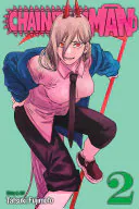 Chainsaw Man, Vol. 2: CHAINSAW vs. BATSee it on collecto.rs
Denji is eating jam on bread, thinking about touching a breast. Three pages later, a devil made of leeches tears through a wall and screams about blood. VIZ Media published this volume in 2020, bringing Tatsuki Fujimoto’s erratic pacing to an English audience without smoothing out the edges. That balance is hard to hit. Horror requires tension, while comedy relies on timing, and Fujimoto demands both inside a single double-page spread.
What makes this second volume work so well in translation is the refusal to clean up the dialogue. When Denji speaks, he sounds crude, uneducated, and preoccupied with basic comforts. The translation keeps his speech short and blunt, matching the hasty ink lines of the art. Where Hunter x Hunter, Vol. 11 uses dense blocks of text to build a world out of geography and rules, Chainsaw Man does the opposite. It strips away the narrator entirely. You get the story through sharp dialogue, wet splatter effects, and quiet moments that cut off without warning.
VIZ printed this run on standard stock with bright red spine lettering that stands out on a shelf. The cover art sets the tone immediately: a yellow background, a neon pink logo, and a main character who looks more like a slasher villain than a hero. It is a precise snapshot of how VIZ handled the modern Shonen Jump shift toward weirder, violent material.
If you keep your manga in a physical archive, this volume marks the point where the series settled into its rhythm. You can track the publication details, print runs, and shelf placement for this release alongside your other VIZ titles on collecto.rs. Export your full catalogue data whenever you want.
9. Hunter x Hunter, Vol. 11#
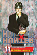 Hunter x Hunter, Vol. 11: Next Stop: Meteor City--The Junkyard of the WorldSee it on collecto.rs
Most shonen manga move from one fight to the next with minimal setup. This volume stops dead in its tracks to explain the political geography, social hierarchy, and trash management systems of a city built on a giant landfill. Yoshihiro Togashi turns an action series into a dense socio-political manual for an entire chapter, and the book is better for it.
Volume 11 marks the real start of the Yorknew City arc. Gon and Killua are trying to buy a video game at an auction, but the story pivots to the Phantom Troupe and their origins in Meteor City. It is a sharp turn into heavy expository prose. Pages that should feel like wall-to-wall text blocks remain legible because of how VIZ handles the lettering. Modern translations like Chainsaw Man, Vol. 2 rely on rapid tonal shifts in dialogue to keep the pace moving, but Hunter x Hunter requires a publisher to manage dense, multi-layered explanations without smothering the original linework. VIZ balances font sizing, leading, and margin placement to keep Togashi's complex world-building readable in a standard 5x7-inch tankobon format.
For a long time, Western releases trimmed or simplified heavy text blocks to keep pages looking clean. Here, the English layout respects the reader's willingness to sit down and read three paragraphs about how a land of cast-offs operates its own legal system. The lettering choices preserve the rhythm of the original Japanese page balance. You get every detail of the arc's setup without feeling like you are staring at a modified wall of prose.
8. Ouran High School Host Club, Vol. 2#
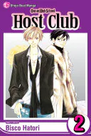 Ouran High School Host Club, Vol. 2See it on collecto.rs
You could spot a Shojo Beat spine across a crowded shop floor in 2005. That magenta strip down the side was unmistakable, a quiet signal that VIZ was taking shojo manga seriously in North America. When the second volume of Ouran High School Host Club arrived in English in 2006, it carried all the hallmarks of that distinct era. The trim size sat slightly larger than standard shonen releases, giving Bisco Hatori’s fine ink lines room to breathe. The publisher kept the original Japanese sound effects intact, placing small English translations right alongside them. It was a localization choice that trusted the reader to learn the visual grammar of the medium rather than scrubbing it clean.
Where the surrounding titles in this list show VIZ solving mechanical problems—like maintaining the punchy lettering of Mashle: Magic and Muscles, Vol. 4—this volume shows the publisher establishing a voice. The comedy in Ouran relies on rapid tonal shifts, moving from lush, full-page romance parodies to minimalist chibi gags in a single frame. VIZ’s adaptation handled the heavy side margin notes and character commentary without choking the page flow. They preserved Hatori’s conversational rants about her deadline diet and studio mess, making the physical book feel like a shared secret between artist and reader.
Holding this early printing today offers a snapshot of a major transition in Western manga publishing. The paper stock has that specific weight of mid-2000s VIZ releases, sturdy enough to hold dense black fills without bleeding through to the reverse page. If you keep your copy on collecto.rs, you can track those subtle physical differences across your shelf, logging publisher imprints alongside print runs. It remains a masterclass in how thoughtful editorial choices can preserve the spirit of a comedy across languages.
7. Mashle: Magic and Muscles, Vol. 4#
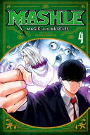 Mashle: Magic and Muscles, Vol. 4See it on collecto.rs
What happens when a comedy series relies entirely on the physical punchline of a panel transition? You find out how much work the lettering does. Hajime Komoto's gag manga about a magicless teenager punching his way through a elite wizarding academy sounds simple on paper. In practice, the humor hinges on precise visual rhythm. A character delivers a pompous, three-paragraph speech about arcane hierarchy. You turn the page, and Mash is silently eating a cream puff, the hand-drawn sound effect floating beside him in bold, heavy lines.
This fourth volume shows VIZ's localization team at their absolute sharpest. Translating Japanese visual gags requires choosing where to place English sound effects without destroying the original ink. Leave the original katakana intact with small sub-text, and the joke loses its momentum. Replace it entirely, and you risk flattening the artist's original linework. Here, the letters match the weight of Komoto's heavy brushes. Huge, blocky English sound effects slam into the panels with the same sudden force as Mash's fists.
Where Ouran High School Host Club, Vol. 2 used its Shojo Beat formatting to lean into dense, overlapping dialogue boxes and soft marginal notes, Mashle relies on white space and sudden, oversized typography. The contrast shows how VIZ adapts its physical layout to suit a book's specific comedic engine. The paper stock in this volume holds the deep blacks of the sound effects cleanly, preventing the ink from bleeding into the adjacent panels where the silent punchlines land. For a book that lives or dies on its visual timing, that printing precision is everything. You get the exact same deadpan drop that a reader in Tokyo experienced when the chapter first ran.
6. Hell’s Paradise: Jigokuraku, Vol. 2#
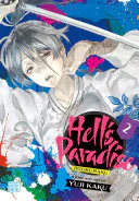 Hell’s Paradise: Jigokuraku, Vol. 2See it on collecto.rs
Thirteen volumes, 127 chapters, one five-and-a-half by eight-inch trim. That larger cut is the footprint of the VIZ Signature imprint, a deliberate physical shift away from the standard pocket-sized shonen format. By giving Yuji Kaku’s linework an extra half-inch of width and height, the publisher signaled a shift in demographic target from the start. You notice the difference the moment you hold it alongside the standard release of Mashle: Magic and Muscles, Vol. 4. Where that comedy relies on sharp, snappy panel breaks fitted into a compact frame, Hell’s Paradise needs the physical room for its ink to bleed and settle.
Set in the late Edo period, the story follows Gabimaru, an hollowed-out executioner offered a full pardon if he can retrieve the elixir of life from a mysterious island. The catch is the island itself. It is a hallucinatory landscape populated by overgrown flora, distorted deity figures, and grotesque fauna that blend Buddhist iconography with visceral horror. Volume 2 settles into this environment, pushing past the initial premise and forcing a cast of condemned criminals and their assigned executioners into uneasy alliances.
Kaku’s art style thrives on hyper-detailed density. He fills background panels with dense cross-hatching, intricate tendrils, and heavily shaded grotesque forms that would muddy into an unreadable black mass at a smaller print scale. The Signature format preserves those line weights. The paper stock feels slightly heavier, holding the heavy blacks on pages where monstrosities split open without warping the sheet or bleeding through to the next page. VIZ kept the original Japanese color pages for the chapter openings here, rendered in muted tones that set the grim, humid atmosphere of the island before dropping you back into black and white. It is a release designed for readers who want to notice the ink.
5. Vagabond, Vol. 21#
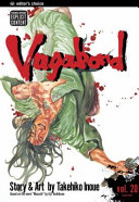 Vagabond, Vol. 21See it on collecto.rs
You do not buy this volume for the plot. That sounds like an insult to a historical epic about Musashi Miyamoto, but it is simply a fact of how Takehiko Inoue works. By this point in the story, the narrative pacing slows to a crawl so the brushwork can take over. Inoue stopped using standard G-pens for this series, switching almost entirely to traditional calligraphic ink brushes. Vol. 21 is where that decision pays off completely across every single page spread.
Most modern releases from VIZ, like Jujutsu Kaisen, Vol. 11, rely on tight panel density and snappy speed lines to keep your eyes moving fast. Inoue does the opposite here. He forces you to stop. Single blades of grass, the fraying weave of a dirty kimono, and the quiet tension in a character's posture carry as much weight as a sword duel. The black ink does not just outline figures. It bleeds into the paper, creating gradient shadows and textures that feel heavy in your hands.
This is where the physical publishing quality actually matters to a collector. Smaller paper stock or poor ink density would smudge these spreads into muddy grey blocks. VIZ printed this run on heavier paper with clean line reproduction, preserving the fine hair-thin strokes of diluted ink alongside pure, deep blacks. You can track the exact pressure of Inoue's hand across a two-page splash.
When you put this on a shelf, it stands out because it treats the medium like a gallery space rather than a quick script. If you are cataloguing your VIZ runs on collecto.rs, this volume is the benchmark for ink preservation. Export your data whenever you like, but keep this physical book close enough to pull off the shelf when you want to look at how ink meets paper.
4. Jujutsu Kaisen, Vol. 11#
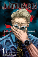 Jujutsu Kaisen, Vol. 11: The Shibuya Incident--Gate Open--See it on collecto.rs
A subway station platform under Shibuya sits packed with civilians while Satoru Gojo stands in the middle of the crowd, calculating how many thousandths of a second he can open his Domain Expansion without frying human brains. Gege Akutami turns the busiest transit hub in Tokyo into a claustrophobic kill box, then spends the next several volumes systematically breaking the rules of modern battle manga.
Volume 11 is where the Shibuya Incident officially snaps shut. Up to this point, Jujutsu Kaisen runs on the familiar Shonen Jump engine: a school for sorcerers, a missing set of cursed fingers, and a clear ladder of escalation. This volume throws that engine into reverse. By isolating the series' strongest character and forcing him to fight surrounded by human shields, Akutami removes the safety net that usually protects a mainline cast. The fallout reshaped how Jump editors structure long-running action titles, proving that readers would follow a narrative that permanently damages its own world state.
Compare this to the VIZBIG release of Dragon Ball Z, Vol. 1, which built the classic blueprint VIZ spent decades perfecting: clear stakes, hero-first escalation, and generational training arcs. Where Akira Toriyama established the foundational rhythm of modern shonen, Akutami uses Volume 11 to dismantle it. The Shibuya arc treats its universe with zero nostalgia, replacing predictable power scaling with spatial logic and grim consequences.
For anyone archiving VIZ's contemporary output, this book marks the exact pivot where the publisher's flagship lineup moved away from clean resolutions toward high-risk serial storytelling. The print edition captures that shift in real time, preserved on standard newsprint paper that feels appropriately unpretentious for a story tearing its own status quo to pieces.
3. Dragon Ball Z, Vol. 1 (VIZBIG Edition)#
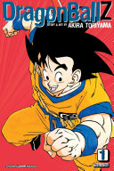) Dragon Ball Z, Vol. 1 (VIZBIG Edition)See it on collecto.rs
Dragon Ball Z, Vol. 1 (VIZBIG Edition)See it on collecto.rs
Most omnibus editions treat three volumes of manga as a bulk discount, squishing three hundred pages of newsprint between a glossy cardboard cover that creases the moment you open it. This VIZBIG edition goes the other direction. It treats Toriyama's work as something worth preserving, upgrading the paper stock to a thick, bright white that keeps the ink from bleeding through to the next page.
The real draw here is the color restoration. VIZ restored the original serialized color chapters for this run, bringing back the muted oranges, soft greens, and washed-out blues that disappeared when the series was first compiled into standard paperbacks. Holding this version next to One Piece, Vol. 3 shows two completely different eras of translation and packaging philosophy. Where that early One Piece volume represents the scrambled rush to localize a massive hit using lightweight paper and altered sound effects, this release reflects a publisher slowing down to get the archive right. The line work is sharp, the blacks are heavy, and the panels have room to breathe.
It is a heavy book. Reading it requires sitting at a desk or laying it flat on a table, which changes how you interact with the pages. You stop flipping through quickly and start looking at how Toriyama built a panel transition or placed a speech bubble to guide your eye across a sequence. VIZ built this format for people who want to look closely at the craft rather than just clear shelf space. If you keep your records on collecto.rs, you can log the specific printing run alongside your standard paperbacks to track how the publisher's archival standards shifted over time.
2. One Piece, Vol. 3#
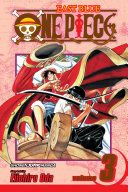 One Piece, Vol. 3: Don't Get Fooled AgainSee it on collecto.rs
One thousand and ninety-six chapters later, the math of Eiichiro Oda's run is almost impossible to parse. This third volume, published in English by VIZ in 2003, sits right at the edge of the East Blue arc where the scope was still small enough to fit inside a local tavern. It covers the climax of the Captain Kuro storyline, introducing Usopp and setting the tone for how VIZ would handle a translation commitment that has now spanned more than two decades.
While Naruto, Vol. 1 established the aggressive bookstore distribution framework that put shonen manga in every American mall, One Piece Vol. 3 represents something more patient. It shows VIZ figuring out how to balance localized pirate jargon with original Japanese sound effects. Early printings still featured the blue-and-white spine design before VIZ standardized their shonen line into the uniform black covers on shelves today. The ink density on this early paper stock holds up well, keeping Oda's dense background hatching crisp even in the tightest panel layouts.
Collecting early single volumes of this run offers a clear look at a publisher finding its footing. The translation choices in these first few books set the rules for character names and terminology that VIZ still adheres to hundreds of chapters later. If you keep your early volumes on a shelf next to the recent releases, the slight shift in paper weight and spine typography documents the evolution of modern manga publishing in real time. It is a working piece of VIZ history you can hold in one hand, built long before anyone knew how far into the grand line the story would actually go.
1. Naruto, Vol. 1#
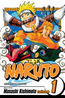 Naruto, Vol. 1: Uzumaki NarutoSee it on collecto.rs
A suburban teenager in 2003 steps into a Borders bookstore, walks past the trade paperbacks, and stops at a spinner rack packed with black-and-white paperbacks reading right to left. They pull down a copy of Uzumaki Naruto, flip it open, and read the first twenty pages sitting on the carpeted floor. By the end of the year, that exact scene played out thousands of times across North America, shifting English-language manga out of specialty comic shops and directly into mainstream retail.
That first volume did not just introduce a loud-mouthed ninja with a sealed fox demon. It established the distribution playbook VIZ used to capture the book trade. Previous translations often arrived late, flipped pages horizontally, or vanished after three volumes. This release committed to the original right-to-left layout, preserved Kishimoto’s line art, and arrived on a predictable schedule that allowed book buyers to stock it next to standard graphic novels.
While One Piece, Vol. 3 laid the groundwork for the publisher's longest continuous translation run, Naruto, Vol. 1 proved that the newsstand format could scale into a massive retail presence. The paper stock was humble, the binding was simple glue, and the cover relied on bold orange inks that held up under harsh store lighting. It looked like something you could carry in a backpack until the corners frayed.
When you log this volume in your collecto.rs catalog, you are tracking the specific spine design that launched the English shonen boom. Keep your copy away from direct sunlight to protect that early VIZ yellow spine from fading.
A manga collection on a shelf is an archive of paper choices, localized lettering, and translation philosophy. The choices VIZ made on these pages set the baseline for how English readers engage with sequential art from Japan. Every trim size, every spine graphic, and every sound effect translation reflects a decision about how to bridge two publishing cultures without flattening either.
As your shelves fill, tracking these details becomes second nature. You notice when a spine layout shifts across printings, when a cover gloss changes, or when a translation team switches tone between arcs. These details make physical volumes worth keeping.
If you want a place to record these specifics, you can catalog your manga on collecto.rs. Log print runs, track individual volume editions, upload high-resolution shelf shots, and keep your data organized. Your catalog belongs to you, and you can export your entire database at any time.
Frequently asked questions#
What is the difference between standard VIZ manga volumes and VIZBIG editions?#
VIZBIG editions combine three individual volumes into a single larger paperback. They use thicker, higher-quality paper stock, include full-color chapter art pages originally omitted from the standard tankōbon releases, and alter the shelf footprint significantly. Standard volumes remain smaller, lighter, and easier to read on the move.
How does VIZ handle series localisations across decades?#
Long-running titles show clear shifts in editorial standards. Early 2000s releases often altered sound effects, adjusted dialogue cadence for Western cultural references, or modified trim sizes. Modern VIZ localisations retain original Japanese sound effects with subtle marginal glosses and mirror the physical tankōbon formats closely.
How can I log and organize VIZ manga volumes in collecto.rs?#
Search for your volume by ISBN or title inside collecto.rs to add it directly to your shelf. You can tag items by publisher, track volume gaps in series runs, and export your entire catalog data to CSV or JSON whenever you want.