The short version#
PRB-01 isn't just a basic reprint set; it elevates key staples with fresh foil finishes, full-art treatments, and updated visual textures.
- Yamato
- Eustass"Captain"Kid
- Kuzan
- Donquixote Doflamingo
- Radical Beam!!
- Charlotte Perospero
- Marco
- Queen
- Otama
- Ryuma
The Premium Booster set PRB-01 does something specific with ONE PIECE CARD THE BEST. Instead of simply reprinting heavy hitters to adjust supply, Bandai reworked the physical surface of cards that players and collectors already know by heart. If you have spent the last two years looking at standard super rares across a game mat or inside a binder, the shifts in texture here are immediately obvious. The foil layouts are heavier. The full-art bleed runs edge to edge without the original frames crowding the illustration. Textures that used to be flat now catch the light with cold-foil stamping and altered rainbow gradients.
That matters because card design is an tactile medium. A reprint set can easily feel like a utility dump, a box you buy strictly to fix deck ratios before a regional tournament. PRB-01 avoids that trap by treating these ten cards as canvas upgrades rather than mere carbon copies. The underlying game mechanics do not change, but the presence of the card on the table does. The contrast is sharper. The line work on key characters stands out against reworked holographic backgrounds that do not bleed into the character art as aggressively as earlier printings did.
Whether you track every set code or simply enjoy the visual evolution of Eiichiro Oda's characters rendered on cardstock, this release marks a clear shift in how Bandai handles card finishes. Some of these cards bring back early block designs that were previously locked behind hard-to-find promo packs or early set runs. Others take staples from recent meta cycles and give them the full-bleed treatment usually reserved for high-tier manga rares. The result is a set where the cardstock itself does the heavy lifting. Here are ten cards from PRB-01 that showcase exactly what this reprint philosophy looks like in hand.
| # | Item | Set / Year | Rarity |
|---|---|---|---|
| 1 | Yamato | -ONE PIECE CARD THE BEST- [PRB-01] | SEC |
| 2 | Eustass"Captain"Kid | -ONE PIECE CARD THE BEST- [PRB-01] | SR |
| 3 | Kuzan | -ONE PIECE CARD THE BEST- [PRB-01] | SEC |
| 4 | Donquixote Doflamingo | -ONE PIECE CARD THE BEST- [PRB-01] | SR |
| 5 | Radical Beam!! | -ONE PIECE CARD THE BEST- [PRB-01] | UC |
| 6 | Charlotte Perospero | -ONE PIECE CARD THE BEST- [PRB-01] | SR |
| 7 | Marco | -ONE PIECE CARD THE BEST- [PRB-01] | R |
| 8 | Queen | -ONE PIECE CARD THE BEST- [PRB-01] | C |
| 9 | Otama | -ONE PIECE CARD THE BEST- [PRB-01] | UC |
| 10 | Ryuma | -ONE PIECE CARD THE BEST- [PRB-01] | R |
10. Ryuma#
 RyumaSee it on collecto.rs
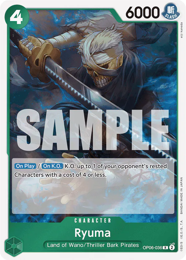
You pull the card from the foil wrapper, turn it toward the light, and notice the blade first. Shusui stretches past the original borders, cutting across the frame where standard rare prints usually stop. The green backdrop of the Thriller Bark swordsman widens out, turning an aggressive deck fixture into a full-bleed portrait.
PRB-01 built its reputation on giving standard set staples a second life, but the treatment works best on cards that spent their first run buried in playmats. In Wings of the Captain, this card did heavy lifting for green decks as a solid four-cost strike that cleared cheap rested characters on entry. You played it, resolved the trigger, and sent it to the trash counter a few turns later. Here, the foil treatment catches the line art along Ryuma's robes and accentuates the heavy shadows around his eyes, framing him like a museum portrait rather than a temporary game piece.
That visual shift mirrors what the set does elsewhere with smaller cards like Otama. Where Otama proves that low-cost utility cards get the same foil priority as massive commanders, Ryuma shows how mid-tier combatants benefit from breaking out of their original frames. The card code OP06-036 stays in the corner, a nod to its tournament roots, but the print itself feels designed for a binder page rather than a deck box.
Holding the card in hand, the textured gloss gives the zombie samurai a weight that the original common-style matte print lacked. It sits at the start of this list because it represents the core promise of PRB-01: taking cards you already know from decklists and giving you a reason to look at them again.
9. Otama#
 OtamaSee it on collecto.rs
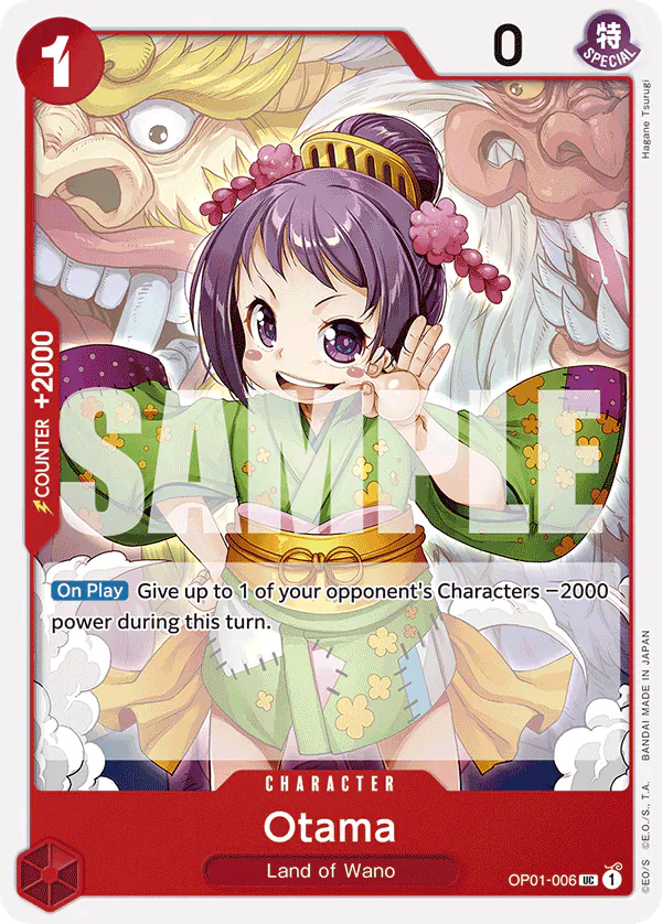
One cost. Two thousand counter. Zero drama.
Otama from Romance Dawn has been sitting in red decks since the game launched. She is not a flashy character card. She exists to fix math. You play her, lower an opposing character's power by two thousand for the turn, and suddenly your Leader can swing into something that looked safe a moment ago. When she stays in your hand, she is a two-thousand counter to keep your own Leader alive. Every red deck runs four copies because the card simply works.
In PRB-01, this Uncommon gets the same gold foil and texture treatment as the set's Super Rares. That choice says a lot about how Bandai approached this collection. In standard booster packs, utility cards like Otama are workhorses. You print them on flat stock, throw them in the draft pile, and move on. Here, the card stock is thicker, the surface catches the light, and the text box sits over a subtle metallic sheen.
Compare this to Ryuma in the same set. Where Ryuma takes a rare combatant and strips away its borders for a frame-extended look, Otama keeps her classic layout but gets a complete material upgrade. Ryuma relies on altered art dimensions to demand attention. Otama relies on print quality. It turns a card you used to slide into a penny sleeve without looking into something you actually want to hold up to the lamp.
That is the quiet strength of PRB-01. It does not limit its production upgrades to the highest rarities or the biggest lore characters. It treats the one-cost cards that win actual matches with the same care as the giant Leader cards. If you spent the last two years bending her edges in local tournaments, seeing her with this level of finish feels earned.
8. Queen#
 QueenSee it on collecto.rs
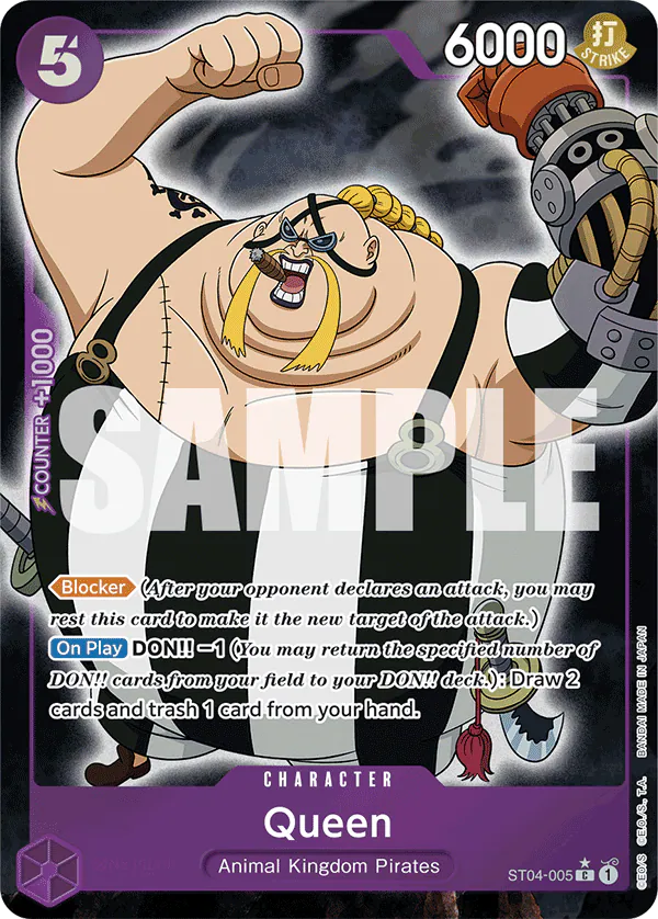
Starter deck cards rarely get the victory lap. You open the box, sleeve up the early staples, and put the rest of the paper away. ST04-005 spent its first life doing heavy work in Animal Kingdom Pirate decks, sitting on the board as a five-cost blocker that cycles two cards when you attack. It was essential, effective, and looked like a utility card printed on standard stock.
PRB-01 changes the physical reality of the card. The common rarity symbol remains on the bottom, but the paper tells a different story. The premium print run gives the purple background a deep, saturated weight that the original starter deck release lacked. Light catches the textured finish across the art box, turning a simple defensive wall into a piece that holds its own in a display binder. It proves that Bandai treated the foundational pieces of the early meta with the same production care as the high-rarity hits.
While Marco relies on full-bleed character art to demand space in your binder, Queen achieves its impact strictly through material quality. The illustration has not changed, but the upgraded card stock changes how the ink sits. The yellow highlights on Queen’s hair and the metallic sheen on his mechanical arm separate cleanly from the dark backdrop. It is a quiet upgrade for a card that spent years taking damage on tournament tables.
If you kept your original copies from the Animal Kingdom deck, put them side by side under a desk lamp. The contrast is immediate. PRB-01 is not about redesigning the game; it is about giving the cards you played every weekend the physical presence they earned. You can catalog both versions in your account to track how the set typography and card stock evolved between prints.
7. Marco#
 MarcoSee it on collecto.rs
What happens when a card you rely on every Tuesday night gets the full-bleed treatment?
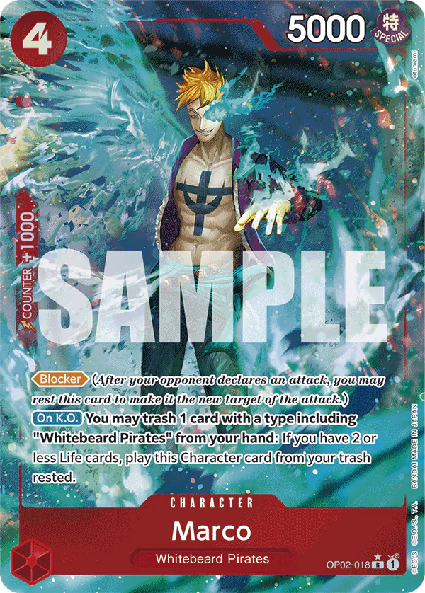
Marco has been a Red deck fixture since Paramount War. You know the loop by now. He enters the board, clears a small threat, and uses his own KO effect to stick around well past his welcome. It is a workhorse card, functional and persistent, the sort of piece that ends up with slightly worn corners because it never leaves your main deck.
PRB-01 takes that familiar utility and stretches the artwork to the very edges of the cardboard. The original OP02 printing framed Marco in the standard Red rare template, keeping the focus tight and contained. This version removes the borders entirely. The blue flames of the Phoenix spread across the full width of the card stock, turning a routine mid-game drop into something that catches the light from across the table. The card stock itself feels firmer than the original print run, giving a heavy play card the durability it actually needs.
Unlike the Queen reprint, which relies on heavy foiling to upgrade a humble starter deck blocker, Marco relies on space. The art gets room to breathe. You still get the exact same card text and the same OP02-018 code in the bottom corner, so it slots right into your existing deck list without any legal fuss. It simply looks like the threat it has always been.
If you are tracking your PRB-01 master set or just keeping tabs on which printings sit in your active decks, you can log every version on collecto.rs and export your full inventory whenever you want.
6. Charlotte Perospero#
 Charlotte PerosperoSee it on collecto.rs
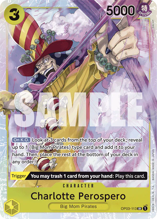
A piece of tape holds the top-loader shut on your desk. You slide the plastic edge down with a thumbnail, catch the inner sleeve, and tilt the surface three inches toward the lamp. The candy cane tongue hits the light first. Then the grid pattern along his coat catches up, shimmering in tight, vertical cuts across the purple ink.
That intricate textured foil work is where PRB-01 earns its keep on Super Rares like this one. In the original Mighty Enemies printing, the card did its job at the back of Big Mom Pirates builds, but the surface remained flat. Here, the foil stamping traces every swirl of Perospero's candied syrup and the crisp lines of his hat. The depth shifts as you turn the card in your hand, giving a three-cost character the visual weight usually reserved for Secret Rares.
While the full-bleed art on Marco relies on scale to grab your attention across the playmat, Perospero works through detail you only catch up close. The micro-hatching across the background gives the purple field a metallic grit, catching ambient light even when the card sits flat in a binder pocket. The card code OP03-113 tucked in the corner marks its origin, but the finish belongs entirely to this reprint set.
If you track your deck lists on collecto.rs, adding this version updates your digital binder to reflect the exact print in your physical deck box. It bridges the gap between a cardboard staple you play every round and a piece of printmaking that holds its own under direct light.
5. Radical Beam!!#
 Radical Beam!!See it on collecto.rs
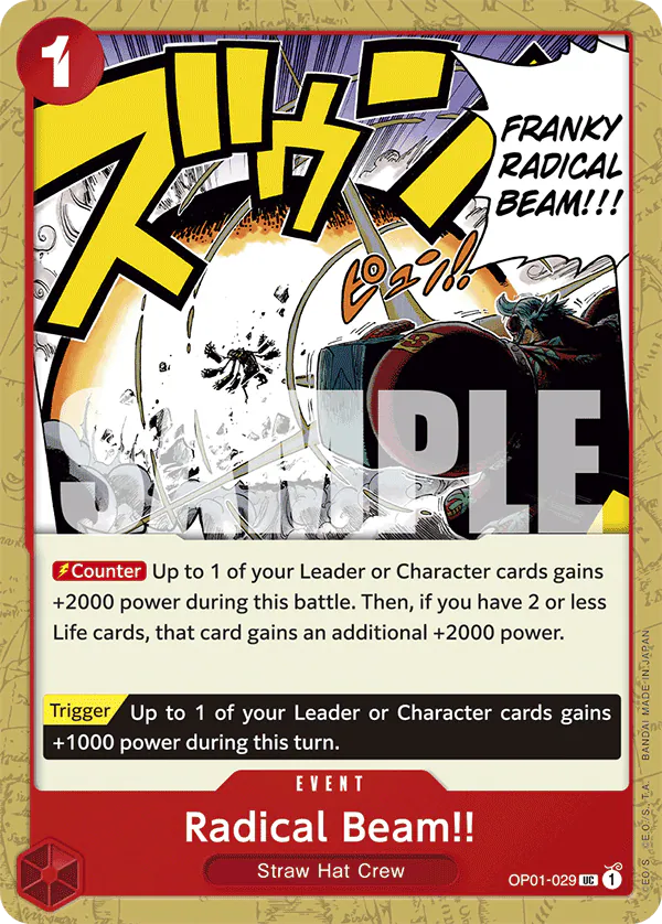
Forget what you thought an Uncommon event card looks like in a modern deck binder. You expect standard black text over a flat backdrop, functional enough to read across a crowded table during a local tournament, then forgotten the moment it hits the trash pile. PRB-01 changes that expectation entirely. Radical Beam!! takes one of the most familiar counter events in the game and treats the graphic design with the same reverence usually saved for high-end character prints.
Where the Charlotte Perospero reprint relies on intricate textured foil to pull your eye across the card frame, this print leans into raw visual contrast. The iconic exclamation marks and bold lettering hit harder here. The line work around the energy blast is crisp, heavy, and trimmed with dark borders that isolate the action from the rest of the text box. The red hues show up darker and more saturated than earlier printings, giving the entire card a weight that matches its actual impact on a match.
That choice matters when you are cataloging a master set. Event cards often feel like an afterthought in display layouts, squeezed between rows of shiny Secret Rares and alternate-art Leaders. This print breaks that pattern. It looks intentional in a sleeve. The typography fills the space without feeling crowded, turning a utility piece into something you actually want to pause on while flipping through a binder page.
When you log OP01-029 into your collecto.rs account, you can tag the specific PRB-01 printing to keep your card history clear. The core tools are free, and your collection data stays under your control, exportable whenever you want to move or backup your list.
4. Donquixote Doflamingo#
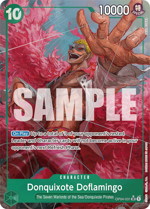 Donquixote DoflamingoSee it on collecto.rs
You tilt the sleeve beneath the desk lamp, and the pink feathers catch the glare before anything else. Then the smile takes over the frame. Donquixote Doflamingo belongs to the fourth main expansion, OP-04, but its appearance in this reprint set strips away the softer pastel hues of the original print run. The linework is thick, black, and heavy around the fingers, leaning entirely into the character’s theatrical menace.
Reprint sets usually risk feeling like an afterthought. They exist to fix secondary market availability and keep constructed formats accessible. Yet PRB-01 handles its Super Rares with an unexpected weight. Where a card like Kuzan uses quiet, metallic framing to demand a second look on a binder page, this Doflamingo relies on aggressive ink density. The shadows under the coat are deep enough to swallow the card text if you look at it from an angle. The glossy coat finish pulls the dark ink forward, making the bright yellow background pop with an intensity that cardboard rarely manages.
Statistically, it remains the same blue control engine it was upon release. The four-cost build stays untouched, keeping its place in decks that want to dictate the pace of the turn. But in the hand, the card feels distinct from its first printing. The cardstock has a firm, crisp snap, and the saturation matches the high-contrast aesthetic PRB-01 applies across its hit slots.
It works as a villainous centerpiece for a dedicated character folder, but it works just as well resting behind clear acrylic on a shelf. If you spent the last year playing a scuffed copy from the original set run, sliding this version into your main deck feels less like an upgrade and more like setting a deliberate tone for the match.
3. Kuzan#
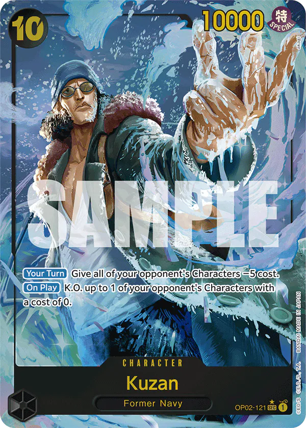 KuzanSee it on collecto.rs
Ten cost, ten thousand power, blue text on black foil. Kuzan comes into play with the weight of an Admiral, wiping out low-cost characters the moment he hits the board. In OP02, the original Secret Rare print was already a prized piece for Navy decks. In PRB-01, the reprint changes how the card sits in a physical binder.
The update gives the frame room to breathe. The card code OP02-121 remains in the lower right, but the metallic foil treatment extends past the old margins, pushing the ice-sculpted typography into high relief. Where Eustass "Captain" Kid uses this set's modern printing updates to fix early-block colour saturation, Kuzan uses the new pass to refine contrast. The deep navy background absorbs light while the frosted silver accents scatter it. Put it in a nine-pocket page next to standard prints, and the difference is immediate. The card feels heavier before you even take it out of the sleeve.
Secret Rares often suffer from visual clutter when sets try to squeeze high rarity cues into standard layouts. Here, the layout respects the original artwork's negative space. The cold palette gives your eyes a place to rest, which is rare for a top-tier rarity card in modern Japanese TCGs. It proves that making a card look premium does not require drowning it in texture. If you built Navy during the Paramount War era, this is the version that honors how much work that deck put in at your local tables.
2. Eustass"Captain"Kid#
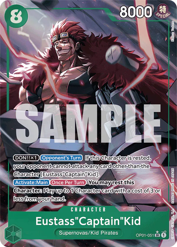 Eustass"Captain"KidSee it on collecto.rs
Some cards enter a deck as quiet utility, while others demand you build a strategy around their presence. This Super Rare version of Eustass "Captain" Kid from Romance Dawn always belonged to the second category, but its original printing buried that ambition under flat colors and muted card stock. The PRB-01 release fixes the print standard, bringing textured foiling and saturated ink to a card that carries eight thousand power and a persistent blocking threat.
Early-block Super Rares suffer most from the gap between how they play and how they look on the page. In its first iteration, Kid was an essential green boss unit that looked identical to a standard rare from across the table. The updated foil pattern in this set catches light across the mechanical arm, giving weight to the dark lines of the illustration without washing out the text box. It sits differently in a sleeve now. Where the Kuzan Secret Rare relies on edge-to-edge premium framing to command space on a binder page, Kid relies on high-contrast surface work that makes an old staple feel heavy again.
Cataloging older cards across multiple printings gets messy fast when text boxes and frame styles shift between sets. Keeping your OP01 original alongside this PRB-01 printing in collecto.rs lets you track how Bandai approaches reprint sets over time, down to the set code and foiling variant. You can export your full card ledger whenever you choose, keeping your data under your control as your collection grows.
1. Yamato#
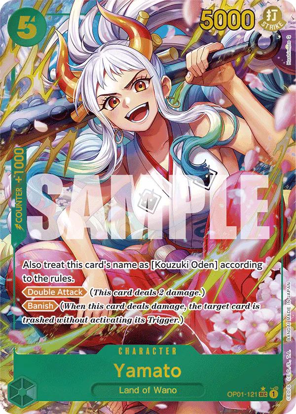 YamatoSee it on collecto.rs
Why does a card from the very first set still pull your eyes away from the rest of the binder? You turn Yamato to catch the light, and the answer shows up in the gold foil tracing the edge of the bisento. Secret Rares from Romance Dawn always had presence, but PRB-01 changes how the surface behaves under a lamp. The printing process used here layers textured foiling directly over the linework, letting the teal background sink back while the figure pushes forward. It makes the original print look almost flat by comparison.
Eustass "Captain" Kid shows off what modern foil application does for a workhorse Super Rare, but Yamato operates on a different scale entirely. At eight cost and nine thousand power with the Double Strike attribute, the card already demanded respect across the table during the early OP-01 format. The PRB-01 version preserves that original art by Sunohara while giving the foil room to breathe around the hair ropes and the floating cherry blossom petals. Nothing gets lost in the shimmer. The gold leafing holds tight to the edges of the character frame rather than flooding the entire card face.
That balance is hard to hit. High-rarity cards often drown their own art in rainbow sheen until you have to tilt the sleeve just to read the text box. Here, the grey OP01-121 code sits clean at the bottom, and the SEC stamp catches a subtle silver glint without competing with the main illustration. It stands as a reminder that the best reprint sets do not need to invent new artwork to create a definitive version. They just need to give the original room to work.
Reworking existing card art is a delicate balancing act. Change too little and the reprint feels redundant. Change too much and you lose the identity that made the original card memorable in the first place. PRB-01 hits the mark by focusing on surface quality. The updated foils, adjusted borders, and full-art treatments give these ten cards a distinct reason to exist alongside their original counterparts.
When a set focuses on visual refinements, the details are easier to appreciate when you can line the printings up side by side. Seeing how a foil pattern shifts from a first-edition print to a Premium Booster release is part of the fun of keeping a collection over time. It shows the evolution of the print technology and the design choices behind the game.
If you are sorting through your own pulls from PRB-01, you can catalog them on collecto.rs. High-resolution imaging lets you track visual variants, note specific condition details, and organize your sets by printing run. Your data remains yours, fully exportable whenever you want it. It is a clean, straightforward space to document your cards as your collection grows.
Frequently asked questions#
What is PRB-01 in the One Piece Card Game?#
PRB-01, titled -ONE PIECE CARD THE BEST-, is a premium reprint set designed to bring back sought-after cards from earlier boosters and starter decks. Beyond simple accessibility, it introduces new parallel rare versions, updated text layouts, and distinct foil patterns across all rarities.
Are the cards in PRB-01 legal for tournament play?#
Yes. Every card in PRB-01 retains its original block number and card code. Because the text and rules text match their original printings, they are fully legal in any official format where the original versions are permitted.
How do alternate art cards work in PRB-01?#
Unlike standard booster packs where alternate arts are strictly high-rarity hits, PRB-01 offers revised art, textured foiling, and full-bleed variants across common, uncommon, rare, and secret rare cards alike, making the set visually unique from top to bottom.