The short version#
Secret Lair releases treat the Magic frame as a gallery wall, using guest artists and outsider aesthetics to reimagine tournament staples and Commander commanders alike.
- Murktide Regent
- Arcane Signet
- Ebondeath, Dracolich
- Queen Marchesa
- Terror of the Peaks
- Grist, the Hunger Tide
- Karazikar, the Eye Tyrant
- Sythis, Harvest's Hand
- Spell Queller
- Daze
Magic cards are tools for a game. They carry power and toughness, rules text, and mana costs. For most of the game's history, their visual design served that function first. The border framed the art. The art depicted the spell. The text box told you what happened when you tapped your lands.
Secret Lair changed that relationship. When Wizards of the Coast launched the sub-brand in late 2019, they started treating the card face like a small gallery wall. Instead of adhering strictly to the house style of high-fantasy realism, they invited street artists, comic illustrators, poster designers, and heavy metal typographers to interpret classic game pieces. Some printings threw out the text box entirely. Others made the rules deliberately difficult to read. The game engine remained underneath, but the surface became an open visual sandbox.
This shift split opinion, as major shifts usually do. Traditionalists saw visual noise that complicated tournament tables. Others saw a long-overdue invitation to treat a sixty-card deck like a curated portfolio. Both perspectives have merit, but the sheer visual range is hard to argue with.
Selecting standout printings from hundreds of drops comes down to how effectively the art reframes the card. A great Secret Lair is not just a beloved tournament staple with a foil sheen. It is a piece that uses an outsider aesthetic to tell a different story about the mechanical identity beneath it. Sometimes that means turning a counterspell into a piece of abstract graphic design. Sometimes it means rendering a legendary creature in the style of a vintage travel postcard or a psychedelic gig flyer.
The ten cards below approach that task from distinct angles. They span tournament formats and casual Commander tables. Each one takes an established card and completely rethinks what it looks like in a sleeve.
| # | Item | Set / Year | Rarity |
|---|---|---|---|
| 1 | Murktide Regent | Secret Lair Drop | mythic |
| 2 | Arcane Signet | Secret Lair Drop | rare |
| 3 | Ebondeath, Dracolich | Secret Lair Drop | mythic |
| 4 | Queen Marchesa | Secret Lair Drop | mythic |
| 5 | Terror of the Peaks | Secret Lair Drop | mythic |
| 6 | Grist, the Hunger Tide | Secret Lair Drop | mythic |
| 7 | Karazikar, the Eye Tyrant | Secret Lair Drop | mythic |
| 8 | Sythis, Harvest's Hand | Secret Lair Drop | rare |
| 9 | Spell Queller | Secret Lair Drop | rare |
| 10 | Daze | Secret Lair Drop | rare |
10. Daze#
 DazeSee it on collecto.rs
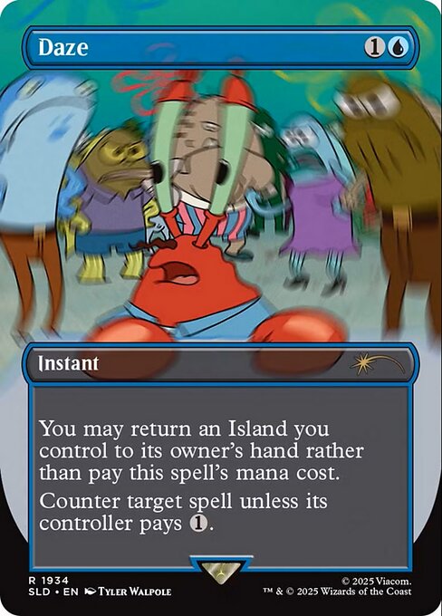
For twenty years, Daze looked like a headache. The original Nemesis printing showed a wizard clutching his temples while blue energy coiled around his brow, a literal depiction of mental strain to match an alternate casting cost that resets your mana development. Tyler Walpole’s Secret Lair Drop version scraps that entirely. It replaces psychological irritation with kinetic scale, swapping the cramped portrait of a tired mage for an imposing, full-frame composition where the magic feels physical rather than neurochemical.
That aesthetic shift matters because Daze rarely sits in a binder. It is a cornerstone of Legacy tempo decks, an efficient free counterspell designed to protect early threats at the expense of returning an Island you control to your hand. Walpole’s rendering treats the card as an event rather than an internal argument. While the upcoming Spell Queller relies on Fiona Staples to deliver intimate, character-driven storytelling, Walpole leans into raw spectacle. Staples gives you comic-panel pacing and deliberate narrative stillness; Walpole gives you a shockwave.
The contrast illustrates what the Secret Lair Drop series does well when it works. It allows staple game pieces with decades of mechanical history to shed their original context. Daze is not rare because of scarce rules text, but Walpole's treatment gives a common tournament workhorse the physical weight of a showcase rare. When you slot it into a deck, the card announces itself across the table before the stack even resolves.
If you keep your playset in a deckbox rather than a display case, it is easy to forget how much visual real estate these legacy spells take up in a game. Logging your specific printings on collecto.rs keeps that distinction clear, tracking the exact version you run instead of flattening it into generic game text. This print turns a familiar disruption into something grand.
9. Spell Queller#
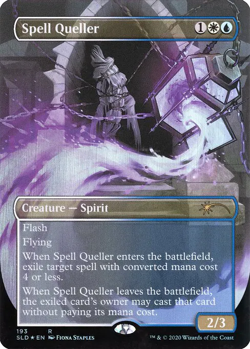 Spell QuellerSee it on collecto.rs
A friend once jammed an Eldritch Moon draft deck onto my kitchen table just to show off a play. They held open mana, flashed in an ethereal spirit, and ate my four-drop out of mid-air. It felt clinical and a little cold. The original art leaned into typical Innistrad gothic horror: pale mists, sharp teeth, and grim shadows designed to look cruel across twenty life.
Fiona Staples gives the card an entirely different pulse. Her line work carries the same loose, expressive weight that defined years of indie comics. The composition trades gothic gloom for clear, readable movement. You see a character mid-gesture, caught in an act that looks less like a predatory ambush and more like a pivotal panel in an ongoing serial. The pale blue tones soften the card's historic bite without dulling its mechanics.
That narrative energy changes how the card sits in a binder. While Craig Drake's portrait of Sythis, Harvest's Hand turns a commander into a static, graphic art print, Staples keeps Spell Queller in motion. It looks like a sequence pulled straight from a storyboard. The spirit feels inhabited rather than decorative, which is a difficult balance to strike within the tiny dimensions of a trading card frame.
Mechanically, the card has always demanded exact timing. You hold three mana, watch your opponent commit resources, and pull the rug out before their spell resolves. Pairing that tactical punch with comic book character design reshapes the card into something personal. It is the sort of printing that stands out precisely because it refuses to blend into the standard visual language of the game. If you catalog your variants by artist rather than set symbol, this one belongs right at the front.
8. Sythis, Harvest's Hand#
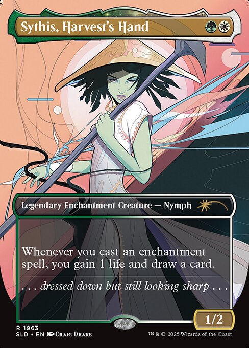 Sythis, Harvest's HandSee it on collecto.rs
You slide the card across the playmat on turn two, and your opponent leans in. They expect the usual green-white enchantress deck piece: soft pastoral lighting, mossy stone, maybe a gentle spray of autumn leaves. Instead, they get Craig Drake's hard vector lines, high-contrast cheekbones, and the kind of sharp gaze usually reserved for an eighties glossy magazine spread.
Sythis, Harvest's Hand is an engine card. Her text box is brutally simple: cast an enchantment, gain one life, draw a card. That efficiency makes her a regular sight across Commander tables. It also means players look at her card face for forty minutes straight while churning through a hundred-card deck. Drake's portraiture takes that constant presence and turns it into pure pop-art silhouette. Where Fiona Staples gives Spell Queller the dynamic, mid-air grit of an indie comic splash page, Drake deliberately flattens the frame. He turns Theros divinity into cool editorial poise.
The flavour text describes her as dressed down but still looking sharp. That feels true to how the card operates. She does not demand sprawling background landscapes or painterly magic effects to announce herself. Minimalist angles and blocky, considered colour choices carry the entire composition. Her spear looks like an art-deco ornament. Her hair sits in heavy, graphic panels that feel closer to a Patrick Nagel canvas than high fantasy scripture.
Secret Lair works best when it offers a genuine departure from standard Magic visual grammar. Sythis sits on that precise intersection: a functionally demanding piece of game cardboard treated like a gallery print. If your Commander deck leans into repetitive, low-curve loops, having Drake's stark line work stare back from the command zone changes the texture of the game entirely.
7. Karazikar, the Eye Tyrant#
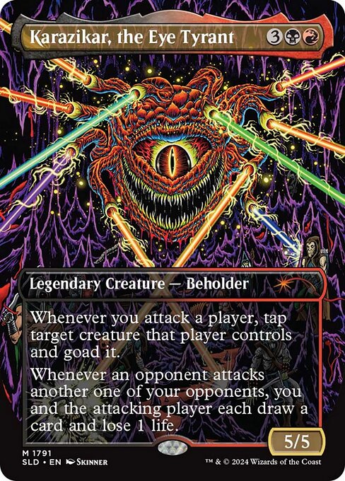 Karazikar, the Eye TyrantSee it on collecto.rs
What happens when you take a creature designed entirely to force bad decisions on a multiplayer table and hand it to an underground comic artist? You get Skinner's take on Karazikar, the Eye Tyrant, and it looks precisely like the headache it creates. The card mechanics run on goad, tapping down an opposing blocker while compelling that creature to swing somewhere else on its next turn. When two opponents beat on each other, you both draw and bleed. It turns the table into an arena where everyone is bruised, but you hold all the leverage. Skinner mirrors that mechanic with line work rooted in seventies monster magazines, weirdo comix, and psychedelic horror. The beholder does not sit quietly inside a standard frame. It seethes outward in violent greens and pustular textures, a dense riot of eyeballs and teeth that dares your eyes to linger. Where Craig Drake's Sythis, Harvest's Hand turns a commander into a clean, restrained editorial fashion portrait, Skinner leans hard into the filth. There is no poise here, only jagged edges and sweat. It matches the psychology of multiplayer politics when cards stop pretending to be polite. The printing gives this mythic rare a distinct physical punch across four feet of playmat, reading like a rogue screenprint smuggled into a deckbox. If you keep your collection organized in collecto.rs, you can tag items by artist or border treatment, making it straightforward to track visual tangents like Skinner's heavy ink style without losing track of your wider Commander binder. That visual friction is the whole point of Secret Lair as a platform. It strips away standard house styling to see how far an individual voice can bend a familiar game piece.
6. Grist, the Hunger Tide#
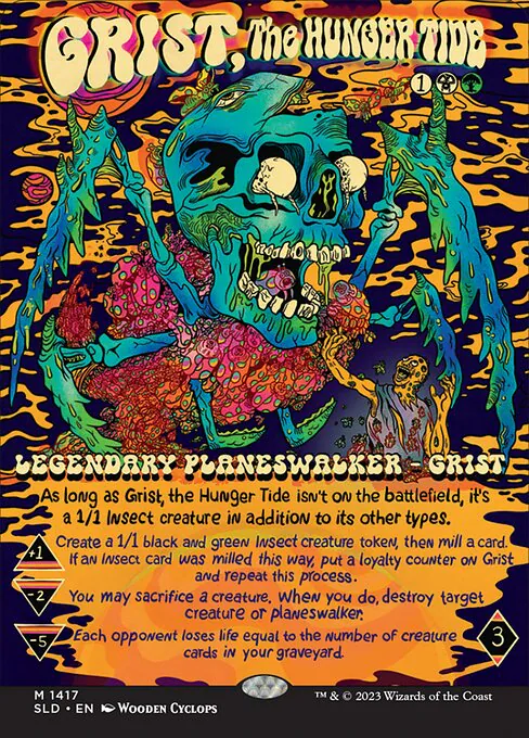 Grist, the Hunger TideSee it on collecto.rs
One loyalty counter. That is all it takes to trigger an engine that behaves less like a traditional planeswalker and more like a localized swarm infestation. Grist sits in your graveyard as a creature, dodges conventional noncreature tutors, and enters the fray as an insect queen that refuses to play by standard card-type protocol.
Most planeswalkers arrive with grand high-fantasy framing. They stand tall against sweeping horizons, cloaked in robes or clad in polished armor. Grist is an aggregate mass of skittering legs and chitinous hunger. The Modern Horizons 2 printing captured that creepiness through dark, textured realism. For this drop, Wooden Cyclops went the opposite route. The art pulls straight from Pacific Northwest skate decks and neon gig posters. Electric magenta, acidic greens, and bold black outlines turn a decaying swarm into Saturday-morning gross-out cartoon bliss.
Where Skinner leaned into subterranean comic sludge for Karazikar, the Eye Tyrant, Wooden Cyclops brings Grist into blinding daylight. The contrast does heavy work. Karazikar’s linework feels intentionally dense and suffocating, matching the political headaches of the goad mechanic. Grist feels fast, irreverent, and loud. The bright palette mocks the morbid mechanical reality of sacrificing your own board to digest an opposing threat. You resolve the loyalty abilities while grinning at a card face that looks primed for the bottom of an eight-inch maple board.
Secret Lair works best when the art direction deliberately clashes with the mechanical tone of the card. A giant hive mind that mills bodies into the graveyard should feel grim. Instead, you get day-glo counterculture punch. If you track your collection on collecto.rs, this is the version you log when you want the binder page to rattle the eye. It takes a Modern staple and strips away the self-seriousness, leaving only teeth, neon, and bad manners.
5. Terror of the Peaks#
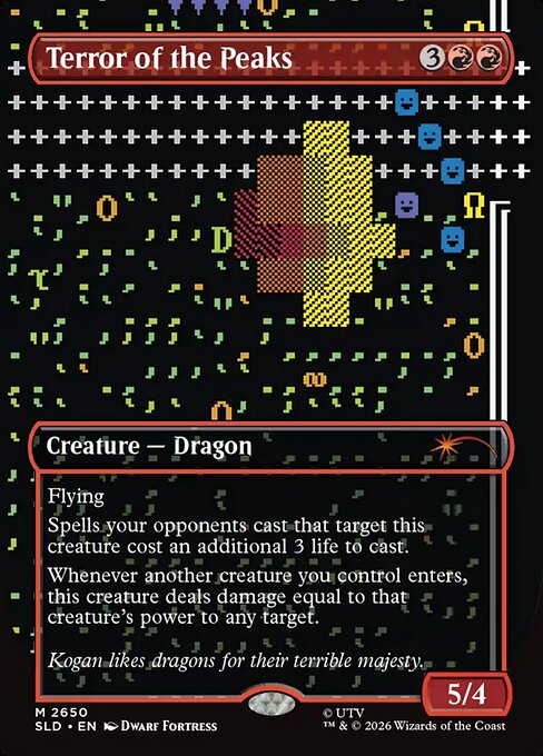 Terror of the PeaksSee it on collecto.rs
A fortress dug deep into limestone is flooding with magma, three miners are tantruming in the dining hall, and somewhere in the caverns below, a winged red beast wakes up. That distinct brand of procedural chaos belongs to Dwarf Fortress, Tarn and Zach Adams' legendary simulation that ran on ASCII characters for nearly two decades before receiving a graphical overhaul. Seeing that visual lexicon stamped onto a mythic Magic card feels like finding your favourite niche indie forum preserved inside a gallery archive.
Terror of the Peaks was already a brutal engine in red. It flies, taxes removal by three life, and flings power as direct damage whenever your other creatures land. In Core Set 2021, it looked like a standard high-fantasy predator rendered in hyper-polished digital oils. Here, the art swaps cinematic sheen for tile-based clarity. The Adams brothers treat the beast with the earnest bluntness of their own game manual, down to the rules text and the quote below: Kogan likes dragons for their terrible majesty. It is direct, literal, and completely unbothered by traditional trading card melodrama.
Where Grist, the Hunger Tide pulls street art into modern deck design, this print looks further back into early PC gaming history. It sits comfortably in the Secret Lair Drop framework because it refuses to blend in. The card behaves less like promotional merchandise and more like an authentic cross-pollination between two deeply stubborn subcultures. You put it in a binder or across from a friend because you appreciate the overlap between complex game engines and paper spellcasting. On collecto.rs, you can log the variant under its original drop, keep track of the specific printing notes, and export your whole registry whenever you decide to reorganize your red staples.
4. Queen Marchesa#
 Queen MarchesaSee it on collecto.rs
Most players will tell you Queen Marchesa is about political paranoia, but this printing treats the throne like a slightly messy parlour. Vanessa Stockard strips away the high-fantasy marble halls and stained glass. In their place, she puts thick brushwork, quiet absurdity, and a small black cat perched right where an executioner should stand.
It works because it undercuts the text box without mocking it. Marchesa still grants the monarch title the moment she hits the table. She still sends a 1/1 Assassin with deathtouch and haste after anyone who dares take the crown away. Yet the portrait feels stolen from a Victorian oil study rather than a tactical wargame. The mood leans toward domestic eccentricity. The violence is implicit, polite, and sitting on a velvet cushion.
Where Justine Jones pushed card legibility to the brink with Ebondeath, Dracolich through needle-fine ink lines, Stockard goes the other direction. She uses heavy paint and deliberate stillness. Up close, the surface reads like oil on canvas that barely had time to dry before being slid into a sleeve. The face is guarded, slightly weary, and completely in charge of the room. It demands that you slow down and inspect the edges of the frame.
Secret Lair works best when an artist reframes a commander you have seen across a hundred tables. Stockard gives this mythic a presence that belongs in a gilded wooden frame as much as a deckbox. If you keep your collection sorted by visual style rather than mana cost on collecto.rs, this sits right at the intersection of traditional gallery art and card stock. It remains lethal, but it keeps its claws tucked into the upholstery.
3. Ebondeath, Dracolich#
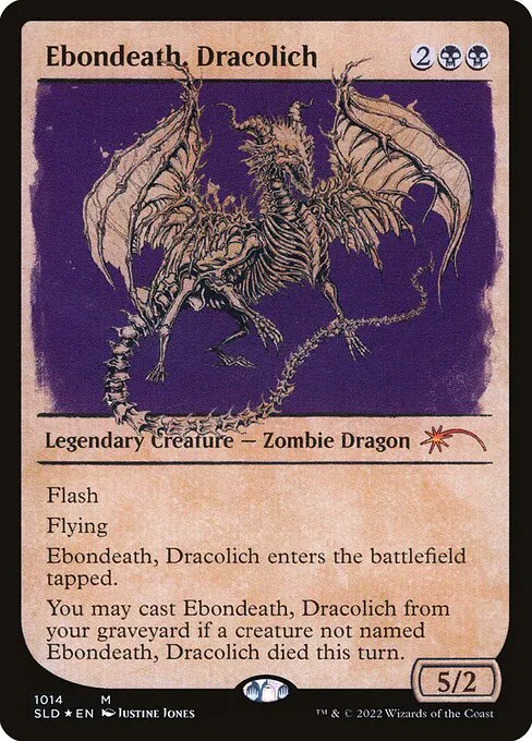 Ebondeath, DracolichSee it on collecto.rs
Most dragon cards announce their arrival with broad sweeps of red paint, gaping jaws, and obvious fire. Justine Jones went the other direction. Her depiction of Ebondeath, Dracolich trades brute theatrical force for dense, microscopic precision. It looks less like fantasy splash art and more like a copperplate etching pulled from a seventeenth-century natural philosophy folio, painstakingly built from crystalline linework that challenges the physical boundary of what can be resolved on a two-and-a-half by three-and-a-half-inch piece of cardboard.
Where Vanessa Stockard uses loose brushwork and domestic absurdity to unseat Queen Marchesa, Jones uses relentless architectural control. Every rib, spine, and wing facet on this skeletal wyrm is rendered with exacting ink strokes. Across a table, the illustration registers as a dark, intricate knot of geometry. You have to pick the card up, tilt it under a desk lamp, and stare directly into the frame to untangle the anatomy. It ignores conventional readability to produce an object that rewards quiet, solitary study.
The mechanics match that cold persistence. Flash and flying let you drop the dragon out of nowhere, but it enters tapped, an awkward corpse dragged back onto the battlefield. As long as any other creature hit the graveyard that turn, you can recast it from your own. The card behaves like an anatomical recurrence, refusing to stay buried.
Secret Lair Drop works best when it treats card faces as gallery space for idiosyncratic printmakers who would never fit into a standard draft booster. This printing turns a utility mythic into a rigorous technical drawing. When you catalog it on collecto.rs alongside classic fantasy prints, it stands out immediately: an ancient skeleton built from hair-thin ink, preserved inside a card frame that can barely contain the detail.
2. Arcane Signet#
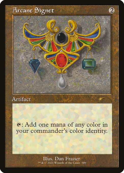 Arcane SignetSee it on collecto.rs
Years ago, an older player at my local shop kept his vintage Moxen double-sleeved in worn leather deck boxes, pulling them out like family silver. The rest of the table ran modern printings, sharp and bright, but those battered brown artifacts held the room. Dan Frazier painted those original pieces in 1993. When Wizards asked him back for this Secret Lair Drop, they handed him a modern staple designed strictly for multiplayer commander decks.
The result feels like a deliberate transmission between two distant eras. The oracle text is clean modern utility: tap to add one mana of any color in your commander's color identity. Yet Frazier renders the ring with the same matte, heavy metal tones and deliberate parchment shadows he brought to the Mox Emerald decades ago. It sits inside the classic brown artifact frame, complete with the notched text box and muted filigree that defined Magic's first decade.
While Mitsuhiro Arita's Murktide Regent imports a foreign artistic dialect into the Modern format, Frazier’s Arcane Signet does the inverse by grounding contemporary play in the game’s original visual vocabulary. Arita pulls an outside icon into the mix. Frazier simply walks back through the front door, paints a modern staple, and makes twenty-five years of design changes look like a continuous thought.
Running it changes how your mana curve reads across the table. It has the weight of an Alpha piece without requiring a safety deposit box. When you catalog your artifacts in collecto.rs, this printing sticks out precisely because it refuses to shout. It bypasses current digital render trends in favor of oil and dry paper, proving that sometimes the sharpest way forward is a direct step backward.
1. Murktide Regent#
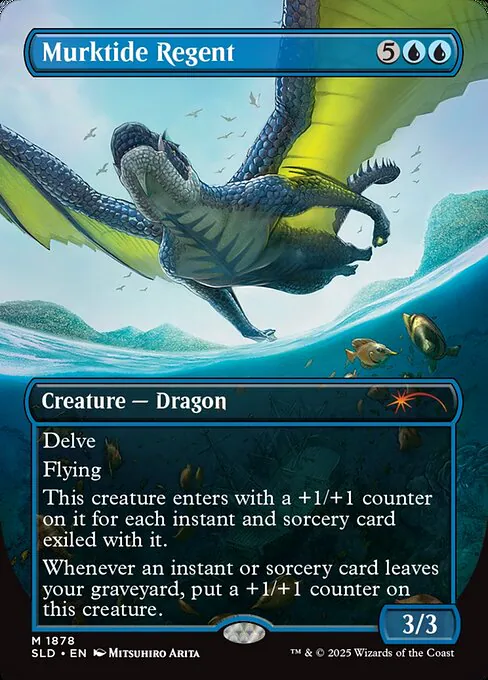 Murktide RegentSee it on collecto.rs
The kitchen table goes quiet when the binder opens to the blue pages.
Two blue mana and five exiled spells hit the graveyard stack. Across from you, your opponent pauses with a hand hovered over their tapped lands. They know what Murktide Regent does mechanically. Modern players have respected the delve math and the flying body since Modern Horizons 2 dropped. What catches them off guard is the hand that painted it.
Secret Lair works best when it makes an impossible crossover feel completely natural. Where Dan Frazier’s Arcane Signet relies on vintage continuity to ground an artifact staple in deep nostalgia, this card does something far bolder. Wizards handed one of competitive Magic’s most brutal finishers to Mitsuhiro Arita. Arita defined the physical look of the Pokémon Trading Card Game from its very first base set. Putting his distinct, heavy perspective work on a mythic sea dragon reframes the card entirely.
Arita paints weight differently than classic Western fantasy illustrators. The dragon coils upward through deep water and churning froth, lit with a cold, pale luminosity. It feels like an authentic artifact from an alternate history of trading card games. The blue frame frames an apex predator rendered by the person who taught an entire generation what pocket monsters looked like in the wild.
That tension earns Murktide Regent the top spot on this list. It is not just an alternate treatment for a powerful tournament card. It is a collision between two foundational pillars of cardboard gaming history, preserved neatly within standard Magic borders. You can catalog it alongside your tournament deck, or keep it in a display binder just to study the linework. Either way, it demonstrates the purest reason this print series exists: letting master artists reinterpret functional competitive power.
When you put an outsider print in a deck, you alter the table's visual language. A player taps two blue mana and reveals something that looks like an underground zine or a silk-screened concert poster rather than a standard piece of fantasy art. That friction is precisely why these printings matter.
Secret Lair drops prove that game pieces do not need to look uniform to function together. They allow personal taste to dictate the visual texture of your deck. A modern tournament list can sit alongside pulp comic covers and hand-drawn line art without losing a single line of rules functionality.
Whether you collect sealed sets or slip individual singles into double-sleeved Commander decks, these variants reward close looking. They turn standard cardboard into specific artistic statements that live in a deckbox.
If you track these printings, collecto.rs gives you a structured place to log specific drops, print variants, and foils. You can catalog your collection, keep track of your variants, and export your data whenever you need it.
Frequently asked questions#
What is the Magic: The Gathering Secret Lair Drop series?#
Secret Lair is a direct-to-consumer print run line launched by Wizards of the Coast in 2019. Unlike standard booster products, each drop contains a small, predetermined set of cards packaged around a specific visual theme or guest artist. These limited-window printings often feature borderless layouts, custom typography, and aesthetics outside Magic's traditional fantasy style.
Are Secret Lair cards legal in sanctioned Magic tournaments?#
Yes, Secret Lair cards are black-bordered tournament-legal cards in any format where the original card is legal. For example, a Secret Lair print of Murktide Regent is fully legal in Modern and Legacy, while Commander cards remain playable within that specific format. Only silver-bordered, gold-bordered, or acorn-stamped novelty prints are banned in sanctioned play.
How can you tell a Secret Lair card from a standard booster print?#
Secret Lair cards feature the unique expansion symbol of a stylized comet or the letters 'SLD' in the lower left information bar. They also feature distinct collector numbers, non-traditional frame treatments, and custom artist credits that do not appear in normal booster sets.